Before releasing of responsive media queries features in #css we develop two different websites version for a single website one is for mobile and second for desktop browsers, but after media we can easily change #css properties to change height widths of elements and DIV Tables, Here is list of examples, I am get these different resolution from Google chrome, to share with you to copy and paste in layout css file.
Resolution 3200px width
This condition used for Lenovo Yoga 3 Pro
@media only screen and (max-device-width:3200px){}
Resolution 2560px width
This condition used for Amazon Kindle Fire HDX
@media only screen and (max-device-width:2560px){}
Resolution 1920px width
This condition used for Microsoft Surface 3
@media only screen and (max-device-width:1920px){}
Resolution 1440px width
This condition used in Laptop with HiDPI screen
Motorola Nexus 6
LG G3
LG G4
@media only screen and (max-device-width:1440px){}
Resolution 1280px width
This condition used in
Laptop with MDPI screen
Laptop with touch
Google Nexus 10
17 Inches Screen Laptop
Asus VivoTab Note 8
Microsoft Lumia 540 Dual SIM
Microsoft Lumia 640 XL Dual SIM
@media only screen and (max-device-width:1280px){}
Resolution 1024px width
This screen now mostly sued in tablets also used in CRT old monitors and 14 inches screen of LCDs , but in LCD and CRT monitors need to show menu as hoverable to and show menu in tablet and smart devices menu show clickable to open submenu or link.
Some names of devices using this width resolution
Apple Ipad
Apple Ipad Mini
BlackBerry PlayBook
CRT Monitor
14 Inches LCD
@media only screen and (max-device-width:1024px){} /*PORTRAIT*/
@media only screen and (max-device-width:768px){} /*LANDSCAPE*/
Resolution 960px width
This condition used for Google Nexus 7
@media only screen and (max-device-width:960px){} /*PORTRAIT*/
@media only screen and (max-device-width:600px){} /*LANDSCAPE*/
Resolution 414px width
This condition used for Apple iPhone 6 Plus
@media only screen and (max-device-width:414px){} /*PORTRAIT*/
@media only screen and (max-device-width:736px){} /*LANDSCAPE*/
Resolution 384px width
This condition used for following devices
Google Nexus 4
LG Optimus L70
@media only screen and (max-device-width:384px){} /*PORTRAIT*/
@media only screen and (max-device-width:640px){} /*LANDSCAPE*/
Resolution 375px width
This condition used for following devices
iPhone 6
@media only screen and (max-device-width:375px){} /*PORTRAIT*/
@media only screen and (max-device-width:667px){} /*LANDSCAPE*/
Resolution 360px width
This condition used for following devices
BlackBerry Z30
Google Nexus 5
Nokia N9
Samsung Galaxy Note 3
Samsung Galaxy Note II
Samsung Galaxy Note S III
Samsung Galaxy Note S4
@media only screen and (max-device-width:360px){} /*PORTRAIT*/
@media only screen and (max-device-width:640px){} /*LANDSCAPE*/
COMPLETE COMPRESSED MINIFIED LIST OF CSS RESPONSIVE CONDITIONS
@media only screen and (max-device-width:3200px){ body{ width:320px;} }
@media only screen and (max-device-width:2560px){ body{ width:2560px;} }
@media only screen and (max-device-width:1920px){ body{ width:1920px;} }
@media only screen and (max-device-width:1440px){ body{ width:1440px;} }
@media only screen and (max-device-width:1280px){ body{ width:1280px;} }
@media only screen and (max-device-width:1024px){ body{ width:1024px;} } /*PORTRAIT*/
@media only screen and (max-device-width:768px){ body{ width:768px;} } /*LANDSCAPE*/
@media only screen and (max-device-width:960px){ body{ width:960px;} } /*PORTRAIT*/
@media only screen and (max-device-width:600px){ body{ width:600px;} } /*LANDSCAPE*/
@media only screen and (max-device-width:414px){ body{ width:414px;} } /*PORTRAIT*/
@media only screen and (max-device-width:736px){ body{ width:736px;} } /*LANDSCAPE*/
@media only screen and (max-device-width:384px){ body{ width:384px;} } /*PORTRAIT*/
@media only screen and (max-device-width:640px){ body{ width:640px;} } /*LANDSCAPE*/
@media only screen and (max-device-width:375px){ body{ width:375px;} } /*PORTRAIT*/
@media only screen and (max-device-width:667px){ body{ width:667px;} } /*LANDSCAPE*/
@media only screen and (max-device-width:360px){ body{ width:360px;} } /*PORTRAIT*/ /*LANDSCAPE-640PX ALREADY DEFINED*/
-
Convert PSD to HTML-CSS for WordPress Theme
Create folder named whatever you want, I am called SDTuts_WordPress and create subdirectories as in following snapshot. Write basic html in...
0.97K viewed
-
css scroll table body – table freeze panes
By default header of table are moving on top position of table when we scrolling down, so that time we...
4.15K viewed
-

Bootstrap remove default padding from col-md col-lg
Removed Default left right padding – minified code Standard no left right padding Individual classes to use specified tag for no...
3.24K viewed
-
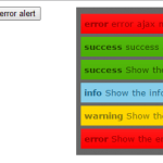
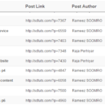
Develop user friendly alerts in jQuery css
We have need the alerts popup to show user friendly alerts and message popup instead a annoying browser alert(‘hhah’); because...
1.25K viewed
-
jQuery CSS Dropdown menu with third level
I am sharing complete code of #jQuery drop down menu, You can easily learn from code and video and copy...
1.31K viewed